
Is your logo or website in need of an update?
Many of my recent identity design projects have been redesigns of existing logos or websites which is one of the reasons I am writing this post: I want to show you just how valuable a good redesign is.

Below I will give you a brief summary on each of my recent client projects, showcasing the before and after shots of each identity.
UKE Luxury Chocolate Gift Baskets

UKE Website Re Design (Old left, New right)

UKE sells unique arrangements of chocolate as an alternative to gift baskets. UKE targets a more upscale market due to the time to make and cost of the product. Eugene contacted me to recreate her whole identity: she wanted the new identity to be bold, have prestige, look luxurious, and be targeted to the upper market.
I redesigned the logo & website for UKE Chocolate Gift Baskets of which you can see the before and after shots above.
You can see larger before & after shots of the website here: Before | After
Pip’s For Hair

Pip wanted her new business logo to be “strong, bold, modern, unique, classy, eye catching, not boring & something different”. The color had to be purple, black or silver to compliment her new salon’s interior decor. The logo was also going to be used for her shop front signage and it was going to be illuminated so this also had to be taken into consideration.
Pip’s main target market is teenagers however she also markets towards the family and the elderly. The salon is based in a country town here in Australia.
I have a post coming soon on the full design process for this logo. I am just awaiting photos of the store signage.
Fitucci Custom Windows & Doors

Erik contacted me as he wanted a redesign of his old logo and he wanted the new logo to be simple yet sophisticated and he also wanted it to reflect professionalism, quality, uniqueness, luxury, innovation and elegance.
I wonder if you can spot the optical illusion? Do the white trapeziums look like windows or doors to you?
I wrote about the design process in full here.
D-Zyne Solutions

D-Zyne Solutions is business based in Melbourne Australia and they offer coding, blog consulting, e-book sites & membership sites. Helen wanted a “structured, innovative, outside the box, stylish” logo that represented D-Zyne Solutions as a whole.
The new redesign features the initials D, Z and S in a grid like pattern that is literally out of the box. The typeface Consolas was chosen for its code like nature.
Freelance Folder

Freelance Folder (www.freelancefolder.com) is a blog dedicated to offering advice, opinions and tips for freelancers.
Salony Creations

Butterfield Photography
Branding redesign for a design studio based in Dubai. Salony means beautiful in Hindi.

Branding redesign for a photography duo based in Southern Arizona, USA.
DKC Global

Logo design for DKC Global – a management consultancy firm based in Germany and USA.
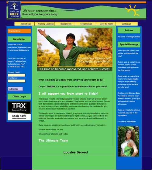
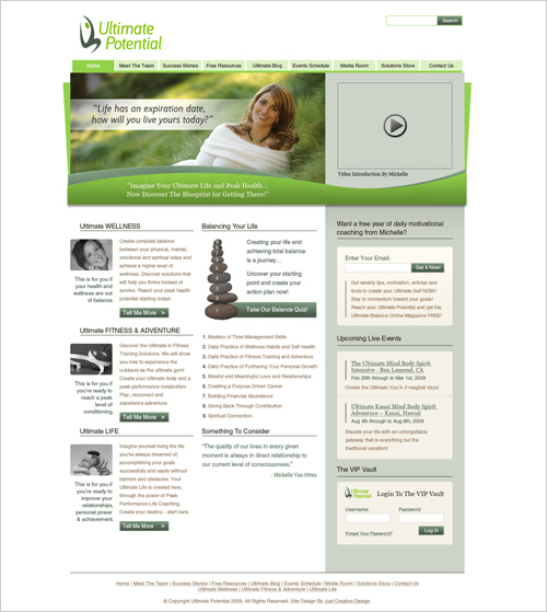
Ultimate Potential

Ultimate Potential Website Redesign (Old left / New right)

Ultimate Potential is a life balance business that offers a variety of services that improves ones lifestyle, body & mind. Ultimate Potential offers workshops, camps, programs, personal training, life training and more.
Michelle wanted a total make over of her old business identity including a new logo design & website design… her new identity needed to demonstrate: “energy, wellness, vitality, life balance, upwards mobility, spirit”. She also requested to see if the initials U & P could be incorporated into the logo.
The green colors give the business a sense of fresh energy and wellness while the abstract logo of the man jumping in the air shows upwards mobility, symbolising vitality and overall happiness which is the goal of Ultimate Potential itself. And hey, it even managed to subtly sneak in the initials U & P (making up the man).
You can see larger before & after shots of the website here:
Before | AfterA walk through of my design process for the Ultimate Potential logo will be published on VectorTuts mid January.
MAC – Malaysian Aesthetic Clinic

MAC (Malaysian Aesthetic Clinic) is a clinic dedicated to advanced non-invasive aesthetic medicine and Karen wanted this to be displayed in her logo. A clinical, professional, geometric logo was preferred and it also had to be suitable for shop signage.
The color scheme was chosen for its natural, clinical look & feel, while the mark itself is made from the initial M titled sideways while also forming a cross.
Influential Blogger

The purpose of Janette’s website Influential Blogger is to get people all over the world to vote for the most influential blogs that are emerging each year and to narrow it down to the top 10 most influential emerging blogs for the current year.
The concept behind the final logo was to portray a crown shaped out of 5 rays of light. The crown is a symbol of power, legitimacy, strength, righteousness, victory, triumph, honour and glory: all traits that an influential blogger has.
The rays of light are symbols of ‘being in the spotlight’ and also of being searched, (ie. a torch) which relates back to the actual purpose of Influential Blogger: to search out the most influential blogs.
You can read more about the design process of this logo here.
Well there we have it, 7 of my latest identity redesigns. The question now is… do you need to rebrand?